
1. What is a mobile friendly website?
A mobile friendly website is a type of website development that ensures content, layout, and functionality are fully optimized for mobile devices such as smartphones and tablets. It is a key part of modern web user interface design and user experience design, helping users easily navigate and interact with a website without needing to zoom or scroll excessively.
2. Why do mobile friendly websites matter for SEO?
Mobile friendly design impacts on page SEO strategies because it affects how your content is displayed, accessed, and understood by both users and search engines. A responsive design website also improves Technical SEO, enhances page speed, and ensures proper indexing by search engines. These factors directly influence your website seo ranking.
3. How to optimize website for mobile friendly design
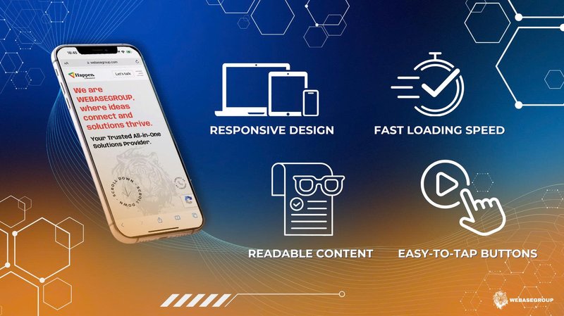
If you’re not a developer, optimizing a website for mobile might sound technical. But in reality, it comes down to making your website easy to use, fast, and clear on a phone. Here are the most important things you should focus on:
3.1 Make your website fit all screen sizes
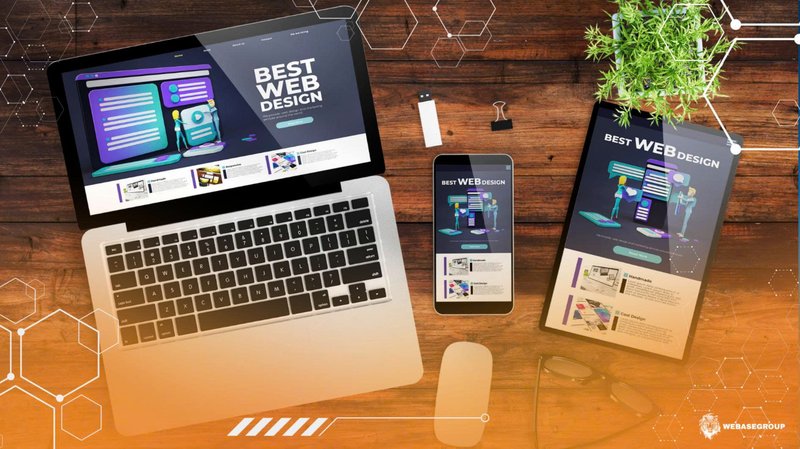
Your website should automatically adjust to fit any screen size. This is called a responsive design website. For example:
- Text should fit the screen without needing to zoom.
- Images should not be too big or cut off.
- Content should stack neatly from top to bottom.
This is a basic step in how to build a website that works well on mobile devices.
3.2 Make your website load faster
Speed is very important on mobile. If your website takes too long to load, users will leave before they even see your content. To optimize web performance, you can:
- Use smaller images.
- Remove unnecessary elements.
- Keep your website lightweight.
A faster website not only improves user experience but also helps your website perform better and supports stronger search optimization.
3.3 Make content website easy to read
On mobile devices, users often read content quickly and on smaller screens. If your content is too long or difficult to read, they may leave your website without finishing it. To make your content easier to read, you should:
- Use short paragraphs instead of long blocks of text.
- Add clear headings to break up content.
- Keep sentences simple and easy to understand.
- Use a readable font size that works well on mobile.
When content is clear and easy to follow, users can quickly find the information they need. This also helps improve on page SEO and overall seo website performance.
3.4 Make buttons easy to tap
On mobile, users tap with their fingers instead of using a mouse. So your website should be designed for touch.
Make sure:
- Buttons are big enough to tap easily.
- Links are not too close together.
- Forms are simple and quick to fill out.
These small details improve the overall user interface user experience and make your business website more user-friendly.
4. WebaseGroup - Trusted website development partner
WebaseGroup provides professional website development solutions with a strong focus on mobile friendly design, helping businesses improve SEO ranking and user experience.
The team ensures every website is:
- Responsive across all devices.
- Optimized for speed and performance.
- Built with user interface design and Technical SEO best practices.
Contact WebaseGroup today to build a mobile friendly website that supports your SEO and business growth.
Website: webasegroup.com
Email: hi@webasegroup.com
Contact: +84 90 936 22 04
5. Final thoughts on mobile friendly website optimization
A mobile friendly website is no longer optional - it is essential for both users and search engines. As more people browse the internet on their phones, your website needs to be easy to use, fast, and clear on every screen. If you want your website to perform well and stay competitive, a responsive design website should always be a top priority.